stuebinm commented on Le Tour du monde en 80 jours by Jules Verne

ah we're in india, racist edition. do like the elephant though, he's cute
ah we're in india, racist edition. do like the elephant though, he's cute
This link opens in a pop-up window
ah we're in india, racist edition. do like the elephant though, he's cute
ah we're in india, racist edition. do like the elephant though, he's cute
found myself in the mood to read more french again and this was at hand
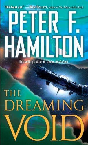
The year is 3589, fifteen hundred years after Commonwealth forces barely staved off human extinction …
not a new thought by any measure, but i don't think i'm in any hurry to read books 2 & 3 of this now
not a new thought by any measure, but i don't think i'm in any hurry to read books 2 & 3 of this now
The year is 3589, fifteen hundred years after Commonwealth forces barely staved off human extinction …
oh, things are finally happening. for a thing screaming "plot-heavy" as much, that sure took a while
oh, things are finally happening. for a thing screaming "plot-heavy" as much, that sure took a while
The year is 3589, fifteen hundred years after Commonwealth forces barely staved off human extinction …
increasingly convinced that Hamilton has a very different thing in mind when he has his characters say "evolution" than I do (and unfortunately mostly not in the good & interesting way 🙈)
increasingly convinced that Hamilton has a very different thing in mind when he has his characters say "evolution" than I do (and unfortunately mostly not in the good & interesting way 🙈)
The year is 3589, fifteen hundred years after Commonwealth forces barely staved off human extinction …
I'm unnerved by the typography in this book. Each chapter has two sub-sections (the 'normal' narration and the 'Inigo's dream' parts), and these look visually so different that at first i assumed they had, for some reason, increased the line height in the Inigo's-dream parts.
some counting of lines on pages later, it seems they haven't, though; instead they set these parts in a different font (fair enough for things set in a 'different universe' — i'm not far enough along to know what that means tho), which is thinner than the normal one, so it leads to the page overall looking lighter. It also looks like the same font they use for chapter headings, where (printed larger) it looks a lot better imho than in normal text.
or at least i think this is what's happening; it's hard to be too sure since pages don't have a …
I'm unnerved by the typography in this book. Each chapter has two sub-sections (the 'normal' narration and the 'Inigo's dream' parts), and these look visually so different that at first i assumed they had, for some reason, increased the line height in the Inigo's-dream parts.
some counting of lines on pages later, it seems they haven't, though; instead they set these parts in a different font (fair enough for things set in a 'different universe' — i'm not far enough along to know what that means tho), which is thinner than the normal one, so it leads to the page overall looking lighter. It also looks like the same font they use for chapter headings, where (printed larger) it looks a lot better imho than in normal text.
or at least i think this is what's happening; it's hard to be too sure since pages don't have a constant number of lines (which is normal, anyways — though some paragraphs still have their first line immediately before a page break), and also the text block sort of wanders higher/lower between pages, which ig is also fair for cheap printing
The year is 3589, fifteen hundred years after Commonwealth forces barely staved off human extinction …
found this lying around and realised i hadn't read it yet.
then again, iirc the only reason i own it at all was that i didn't want to leave munich's second-hand english book shop without at least getting something, but amazingly they didn't have much (at least for (science) fiction/fantasy) which i either hadn't read already or sounded profoundly uninteresting, but at least i remembered having once enjoyed a thing Peter F Hamilton wrote years ago, so that was that.
so far it's like, mid-to-interesting 'standard' science fiction which is irritatingly uninterested in the social implications of the world it depicts. also it doesn't help that the author's seemingly never heard the word "queer" in his life …
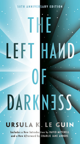
On the planet Winter, there is no gender. The Gethenians can become male or female during each mating cycle, and …